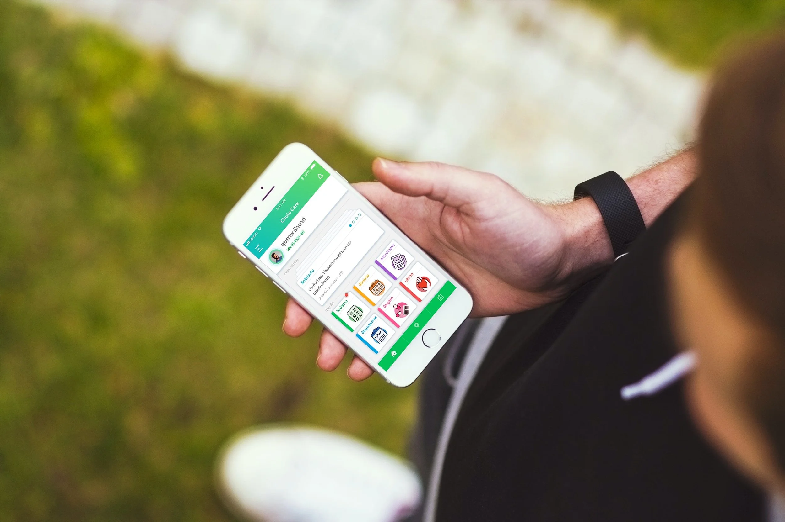
Chula Care
Case Study · Healthcare Mobile App
Chula Care is a digital healthcare platform developed through a collaboration between Kasikornbank and Chulalongkorn Hospital. The project aimed to simplify and modernize the hospital appointment experience for patients and caregivers, offering both a mobile app and an in-hospital kiosk system. The solution was designed to reduce reliance on physical queues, minimize waiting stress, and increase patient confidence in managing appointments through clear digital workflows.
Client
Kasikornbank × Chulalongkorn Hospital
Year
2017
Role
Lead UX/UI Designer
Platform
Mobile Application · Hospital Kiosk · Healthcare

My Role
Lead UX/UI Designer
Collaborated with
2 Researchers · 4 UX/UI Designers
As the lead UX/UI designer on Chula Care, I was responsible for shaping the end-to-end user experience across both the mobile app and hospital kiosk system. I mapped patient journeys, designed task flows, and created wireframes, prototypes, and final UI components. My work included defining interaction patterns that balanced hospital operations with patient needs, designing for accessibility (especially for elderly users), and ensuring a consistent experience between mobile and kiosk platforms. I also collaborated closely with hospital staff, Kasikornbank stakeholders, and the engineering team to align requirements, validate design decisions, and support implementation.
The Challenge
Problem
Patients at Chulalongkorn Hospital often faced long, exhausting waits — sometimes up to 5–6 hours — to see a doctor, even after securing a queue number. The lack of accessible digital tools meant patients had no easy way to manage appointments, track their place in the queue, or receive timely updates, which increased stress and uncertainty.
Design Goal
The goal was to design a digital solution — spanning both mobile app and hospital kiosk — that would simplify appointment booking and management. The design needed to provide clear task flows, visual reassurance at every step, and an inclusive experience accessible to users with varying levels of digital literacy, particularly older adults.
Constraints
The solution had to integrate with existing hospital backend systems and administrative processes, limiting how much could be automated or restructured. Additionally, the design had to accommodate technical limitations of in-hospital kiosk hardware and ensure consistency between mobile and kiosk platforms, all within tight timelines set by stakeholders.
The Discovery
Stakeholder and User Research
To ensure the design addressed real needs, I conducted targeted interviews with key groups, aiming to capture perspectives from leadership, frontline staff, and patients themselves. Each group offered unique insights that shaped both strategy and design priorities.
Hospital Board of Directors
The board emphasized the need for the project to deliver operational improvements, better patient outcomes, and higher satisfaction levels. They saw success as measurable through shorter wait times, improved patient feedback scores, and increased revenue. At the same time, they acknowledged constraints such as budget limitations, regulatory requirements, and the challenges of working within the hospital’s existing infrastructure.

Frontline Nurses
Nurses described daily challenges like heavy workloads, frequent interruptions, and manual, paper-based processes that slowed them down. They highlighted how redundant paperwork and inefficient workflows contributed to frustration and reduced productivity. Their suggestions included adopting technology to automate routine tasks, improving communication tools, and streamlining procedures to reduce their burden and support better care delivery.

Outpatients
Patients consistently praised the kindness and dedication of hospital staff, but expressed frustration with long wait times, unclear communication about their place in the queue, and difficulty navigating the hospital. They wanted clearer directions within the complex building layout, better updates during their appointment journey, and materials that could help them better understand and manage their health.


Key Insights
These activities reinforced several design imperatives. Patients needed greater transparency at every stage — from booking to arrival to consultation. Elderly patients and caregivers required extra support through large, clear UI elements and simplified task flows. Nurses and staff needed systems that reduced manual work and improved communication. And both patients and staff would benefit from tools that addressed the hospital’s complex physical layout, supporting easier wayfinding during each visit.

The Design
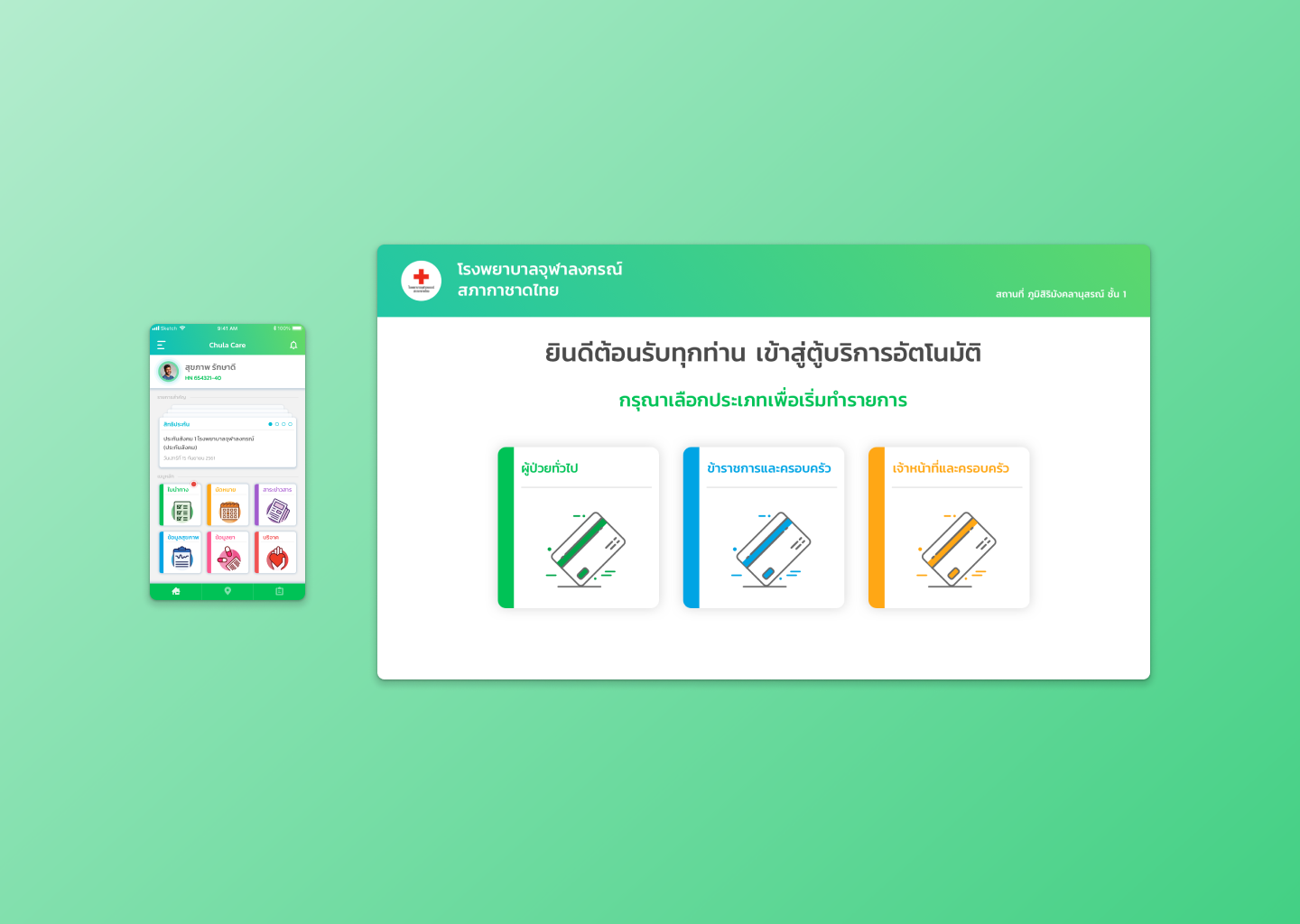
Booking and Queue Management
I designed a streamlined booking flow that guided patients step-by-step through selecting a department, doctor, and time slot, with clear progress indicators at each stage. The flow prioritized simplicity, minimizing the number of screens and choices per step to reduce cognitive load. Once booked, the system provided prominent confirmation screens and integrated push notifications to reassure patients and reduce anxiety about their appointments. For queue management, I introduced real-time status updates — both in the app and kiosk — so patients could monitor their position in the queue without needing to physically wait near the clinic at all times.
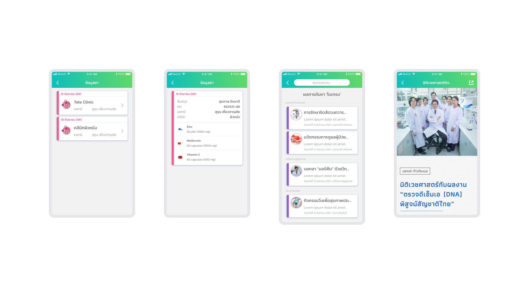
Medication Details
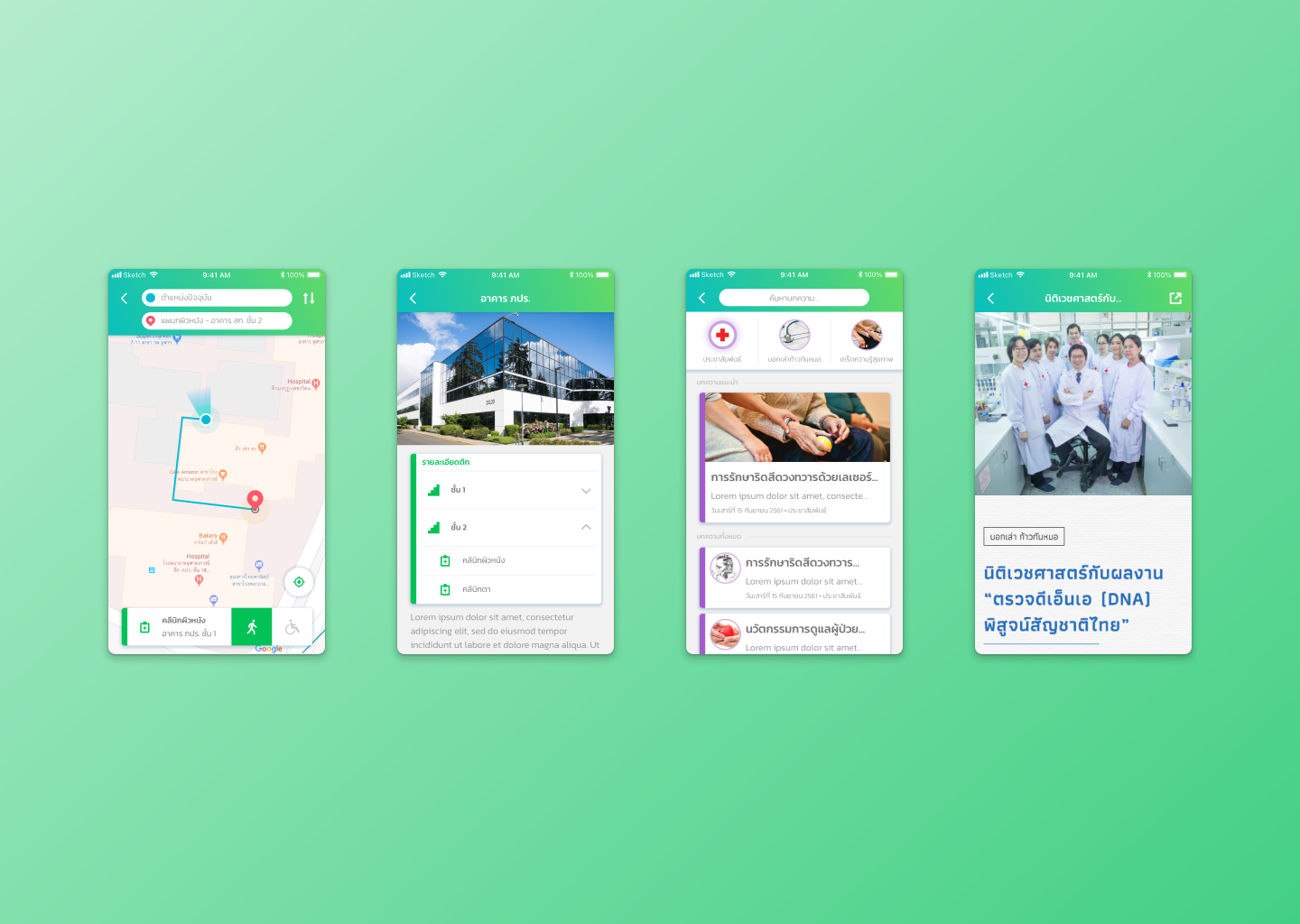
The Medication Details section lists all prescribed medicines alongside dosage instructions, refill dates, and any special precautions. Accessible both in the mobile app and via printable kiosk receipts, this feature ensures patients and caregivers have clear, accurate information for follow-up care, reducing confusion and improving adherence.
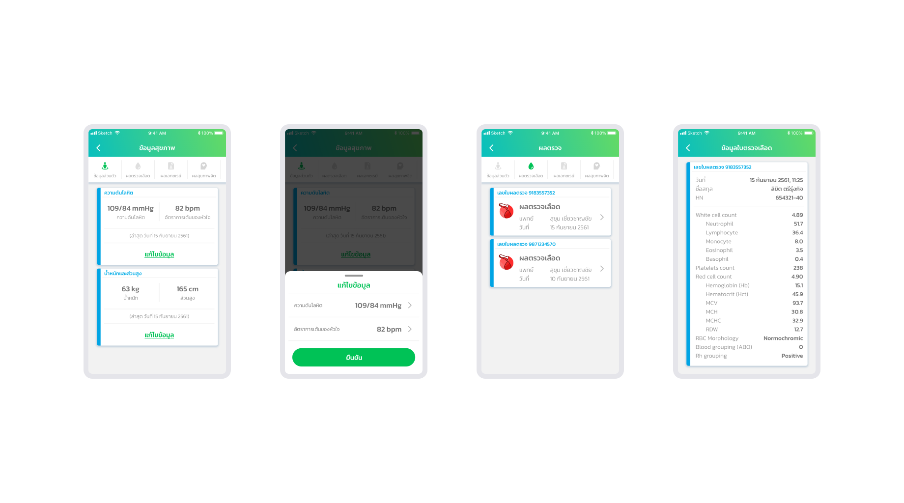
Health Check Reports
Introduced a Health Check Report feature that presents patients’ latest vital signs and test results in a concise, easy-to-read summary immediately after check-in. This report highlights metrics like blood pressure, temperature, and heart rate, and uses simple visual cues (e.g., color bands for normal vs. alert ranges) to help patients and caregivers quickly understand their current health status.
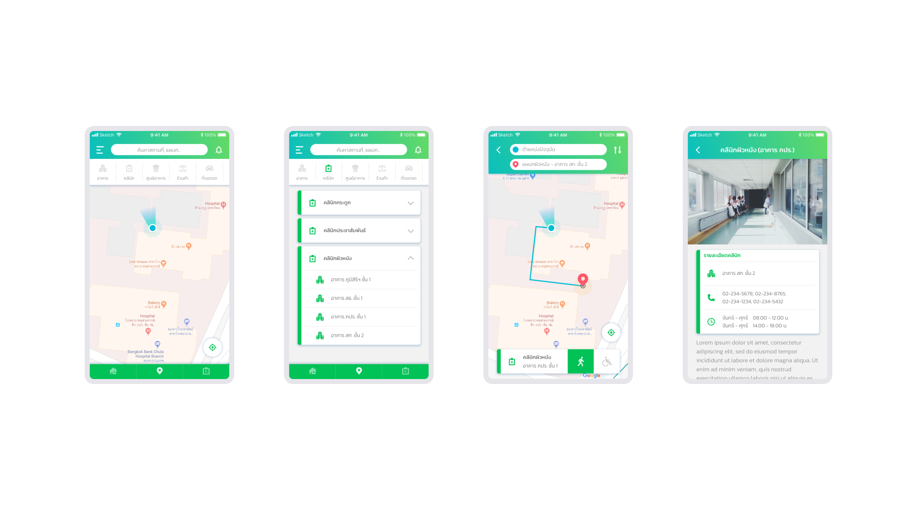
In-Hospital Navigation
To address the hospital’s complex, overlapping building layout, I incorporated a basic wayfinding system into both the mobile app and kiosk interface. This included clear, simplified maps showing the location of key departments and step-by-step directions from main entry points to clinics. The design emphasized large icons and high-contrast colors to ensure readability, particularly for elderly users who might struggle with smaller text or cluttered layouts.

Visual Accessibility Enhancements
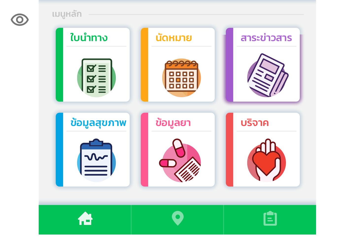
To ensure patients with low vision can navigate the system confidently, the UI uses:
Large, Color-Coded Tiles: Each function (Directions, Appointments, News, Health Data, Medication, Donations) is presented as a spacious card with a bold, high-contrast icon and a distinct accent stripe. The generous padding and clear separation help users quickly distinguish options.
High-Contrast Iconography: Icons are rendered in dark, saturated colors against bright, white backgrounds—meeting WCAG AA contrast ratios—so even users with reduced sight can recognize each symbol at a glance.
Oversized Touch Targets: All interactive cards and bottom-nav buttons exceed 44×44 px, providing ample tappable area to reduce mis-taps.
Consistent Visual Language: A unified style for cards, typography, and navigation ensures that once users learn one element, they can apply that knowledge across the interface.
Persistent Bottom Navigation: A bright green bar with clearly labeled home, location, and tasks icons remains visible on every screen, giving users a constant reference point and helping them recover if they lose their place.
These design choices combine to create an interface that’s not only visually striking but also highly usable for patients with varying degrees of visual impairment.
The Result
Mobile App
The Chula Care mobile app provided patients with a clear, on-the-go way to manage their appointments. Users reported reduced anxiety as they could track their place in the queue digitally, rather than waiting in line for hours. Elderly patients and caregivers particularly appreciated the simplified booking flow and timely push notifications, which offered reassurance and eliminated confusion about next steps.

In-Hospital Kiosk
The in-hospital kiosks complemented the mobile experience by offering a self-service check-in point. Staff observed shorter lines at reception as patients used kiosks to confirm arrivals and view updated queue statuses. This shift reduced crowding at clinic entrances and freed up staff time by cutting down on basic status inquiries, paving the way for a planned expansion of kiosks into other departments.
Deliverables
I produced a complete mobile app (iOS and Android) and kiosk interface design, including detailed wireflows, high-fidelity UI screens, interaction prototypes, and developer-ready specifications. The final design system established consistent patterns across both platforms and served as a model for future healthcare digital projects within the organization.


The Reflection
What I Learned
Chula Care reinforced the importance of designing digital healthcare tools that balance clarity, inclusivity, and emotional reassurance. The project deepened my understanding of how accessible, thoughtfully designed flows can reduce stress and build trust in high-stakes environments like hospitals. It also highlighted how small features — like clear confirmations or basic wayfinding — can have a significant impact on patient confidence and satisfaction.
What I Would Improve
If I were to revisit the project, I would advocate for conducting more rounds of iterative usability testing directly with elderly patients and caregivers during the early design stages. While we gathered valuable feedback post-launch, testing earlier would have allowed us to fine-tune accessibility choices more proactively, especially for the kiosk interface.
What Comes Next
The successful pilot in the outpatient clinic laid the groundwork for scaling Chula Care to other hospital departments. For me personally, this project strengthened my approach to designing in complex, operationally constrained environments — where user trust, simplicity, and alignment with service processes are critical to success.