Señorita
Case Study · E-commerce with Brand Experience
Señorita is an e-commerce website created for Mitr Phol Group’s lifestyle sugar brand, designed to elevate sugar from a basic commodity to a sensory, premium experience. The goal was to combine commerce with brand storytelling, helping users connect with the product’s flavor, mood, and identity. I worked independently across UX, UI, and research to create an experience that translated taste and aroma into engaging, meaningful visuals.
Client
Mitr Phol Group
Year
2021
Role
Main UX/UI Designer · Visual Concept Designer · Researcher
Platform
Responsive Website · E-commerce

My Role
Main UX/UI Designer · Visual Concept Designer · Researcher
Collaborated with
1 PM
I worked independently on Señorita, leading both UX and UI design as well as the research and concept development. My responsibilities included defining the site structure and user flows, creating wireframes and prototypes, and designing the full visual system that linked product flavor to color, form, and mood. I translated the brand’s lifestyle positioning into a digital experience that balanced usability with creative storytelling.
The Challenge
Problem
Señorita was a new entrant in a market already dominated by well-established sugar brands. Sugar is typically perceived as a commodity product, which made it even more challenging to create emotional connection or differentiation in an e-commerce setting. The task was to design a digital experience that positioned Señorita as a lifestyle brand — one that conveyed flavor, mood, and identity in a way that engaged users beyond just price or utility.
Design Goal
The goal was to create an e-commerce site that combined a clean, easy-to-use shopping flow with rich brand storytelling. The experience needed to translate abstract product qualities like taste and aroma into visual and interactive elements that could evoke emotion and build customer affinity.
Constraints
As a solo designer and researcher, I needed to balance creative exploration with practicality, delivering a solution that was feasible for implementation while still pushing the visual identity of the brand in new directions. The platform also had to work seamlessly across mobile and desktop without sacrificing the richness of the brand expression.
The Discovery
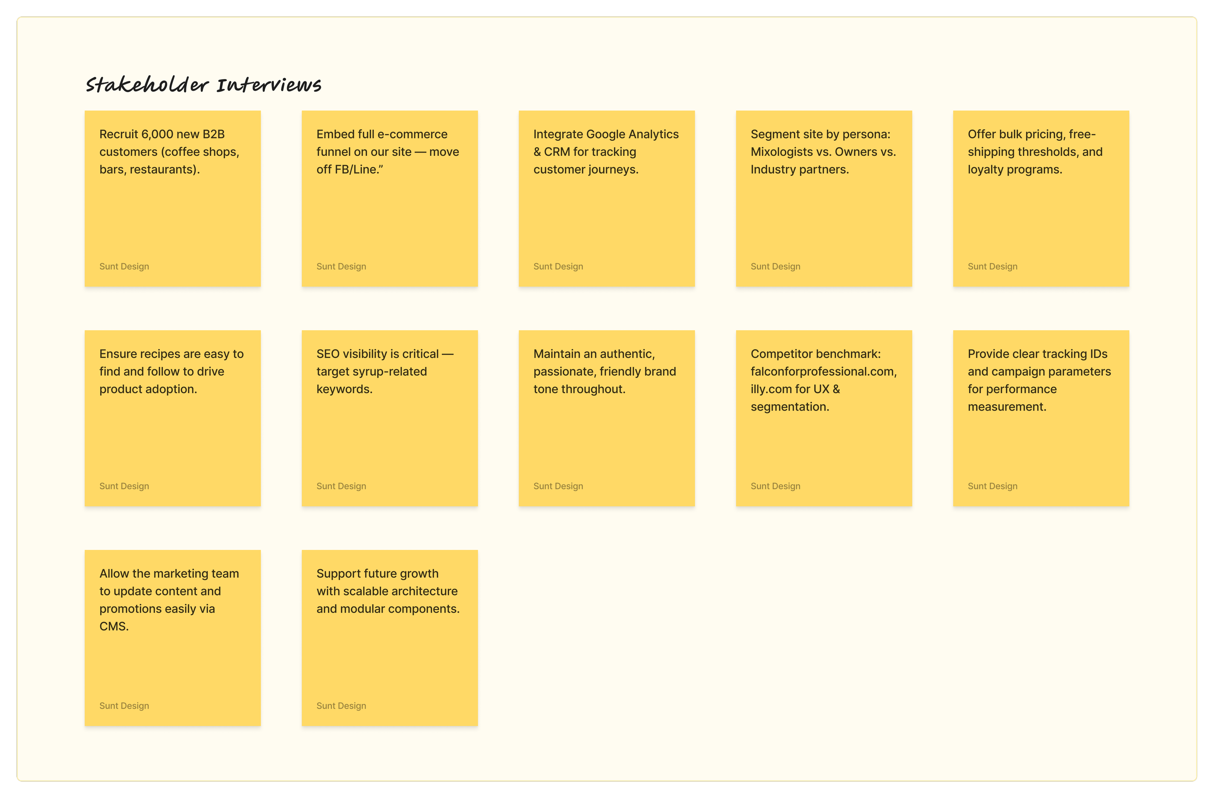
Stakeholder Interviews
I began by meeting with the Señorita leadership and marketing team to align on business goals and technical requirements. They stressed the need to recruit 6,000 new B2B customers, embed a full e-commerce funnel on the site (versus off-platform sales on Facebook/Line), and integrate analytics/CRM for clear ROI tracking.
User Interviews
I conducted 10 in-depth interviews with each key user group to capture a broad range of perspectives and needs:
Mixologists (Baristas/Bartenders): Across ten interviews, professionals emphasized the importance of quality and aroma, creative flexibility in recipes, and ingredient transparency when selecting syrups.
Café & Restaurant Owners: In ten additional interviews, owners highlighted the need for cost-effective bulk pricing, reliable delivery schedules, menu versatility, and streamlined ordering workflows to keep their operations running smoothly.
These conversations provided actionable insights that directly informed both the visual storytelling and the functional requirements of the e-commerce platform.
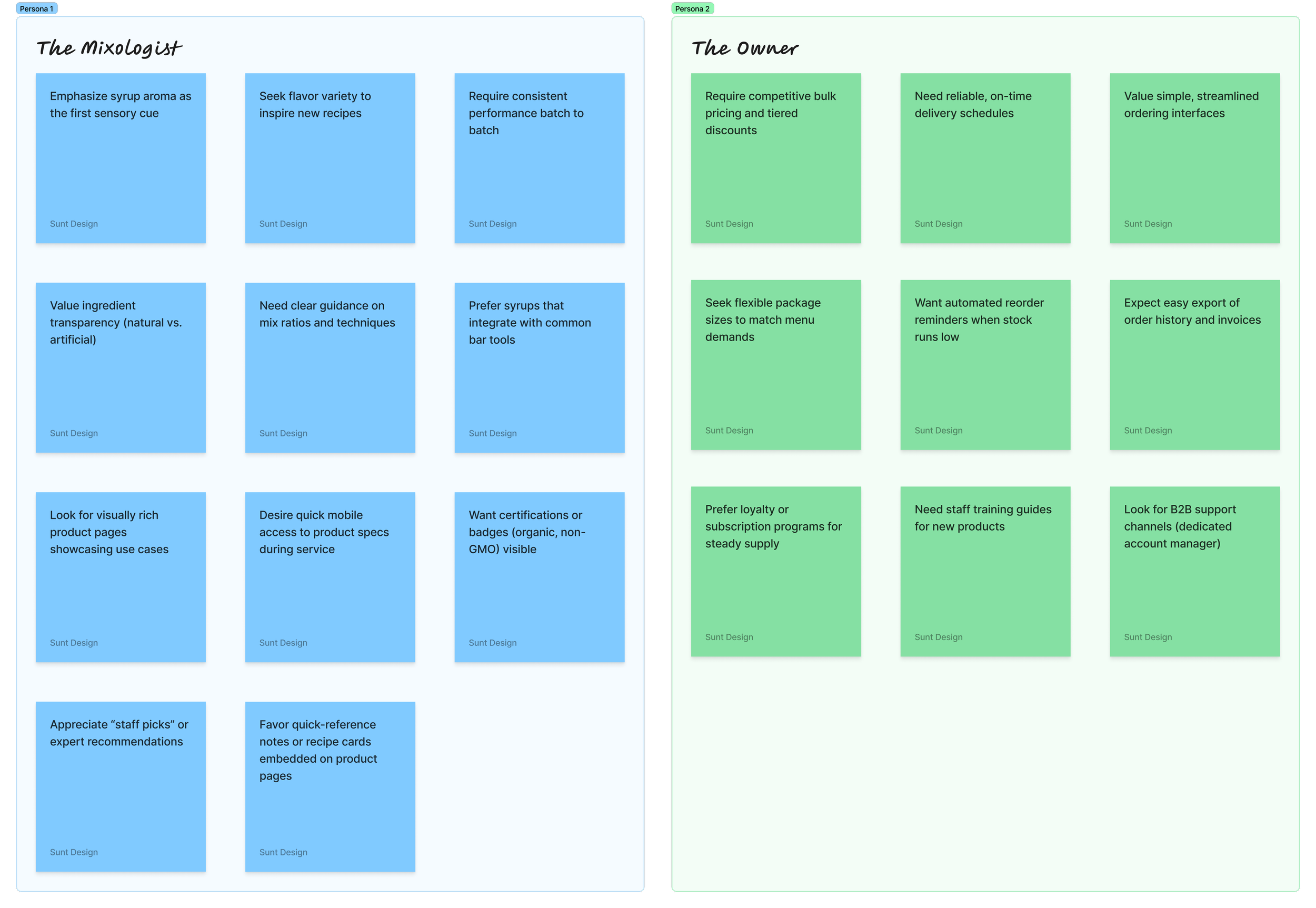
Persona 1: The Mixologist (Barista / Bartender)
Mixologists are driven by the pursuit of quality, flavor, and creativity in their craft. They prioritize syrups that enhance the taste and aroma of their drinks, whether in coffee, cocktails, or specialty beverages. Reputation and reliability of the brand matter deeply, as consistency in flavor impacts customer satisfaction and their own professional standards. They look for syrups that enable experimentation — products that can be combined easily with other ingredients to create unique flavor experiences. Increasingly, they are also attentive to ingredient transparency and health-conscious trends, favoring syrups that use natural ingredients and avoid artificial additives.

Persona 2: The Owner (Cafe / Bar / Restaurant Owner)
Owners balance creative aspirations with business realities. Their primary concern is cost-effectiveness — ensuring syrups offer good value while supporting profit margins. They seek reliable suppliers who provide consistent quality and dependable delivery. Long-term partnerships are important; owners value suppliers who understand their operational needs and are willing to collaborate on promotions or specials. Menu versatility is another key factor, as owners want syrups that appeal to a wide range of customer tastes to help boost satisfaction and loyalty.

“When our head bartender raves about a syrup’s quality and aroma, we trust his expertise and always follow his recommendation for our menu.”
A Critical Dynamic
One of the most impactful insights from the research was the influence mixologists have on owners’ purchasing decisions. Owners often defer to the recommendations of their mixologists when selecting syrup brands, recognizing the expertise and craft behind their choices.

The Design
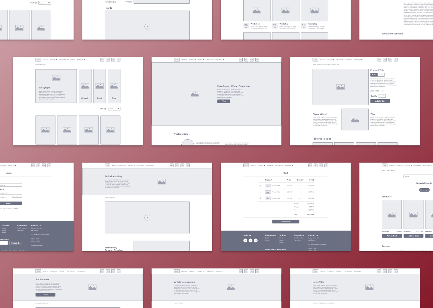
E-commerce Flow and Structure
To accommodate diverse user segments, we designed three tailored flows—B2C, B2B, and Industry—each optimized for its audience while maintaining a coherent, task-focused structure.
B2C Flow
Individual consumers begin at either Product Lineup or Our Sugar before proceeding to Product Detail. From there, is a straightforward funnel prioritizes quick discovery and seamless checkout.B2B Flow
Business customers have two parallel entry points—Product Lineup for purchasing and Blog/Event pages for brand engagement.From Product Lineup, they follow the same path as B2C.
From Blog or Event, they move to Contact, then Subscribe, supporting lead generation and relationship building before conversion.
Industry Flow
Large-scale or specialized partners access Customer Service directly, then fill out a Contact Form, and await a Salesperson Contact Back. This minimal path emphasizes personalized outreach and enterprise-level support over self-service purchasing.

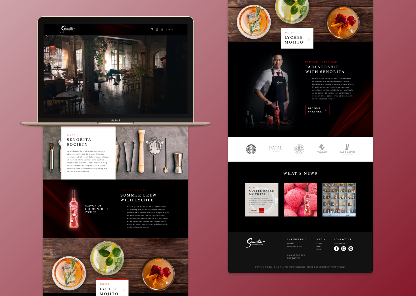
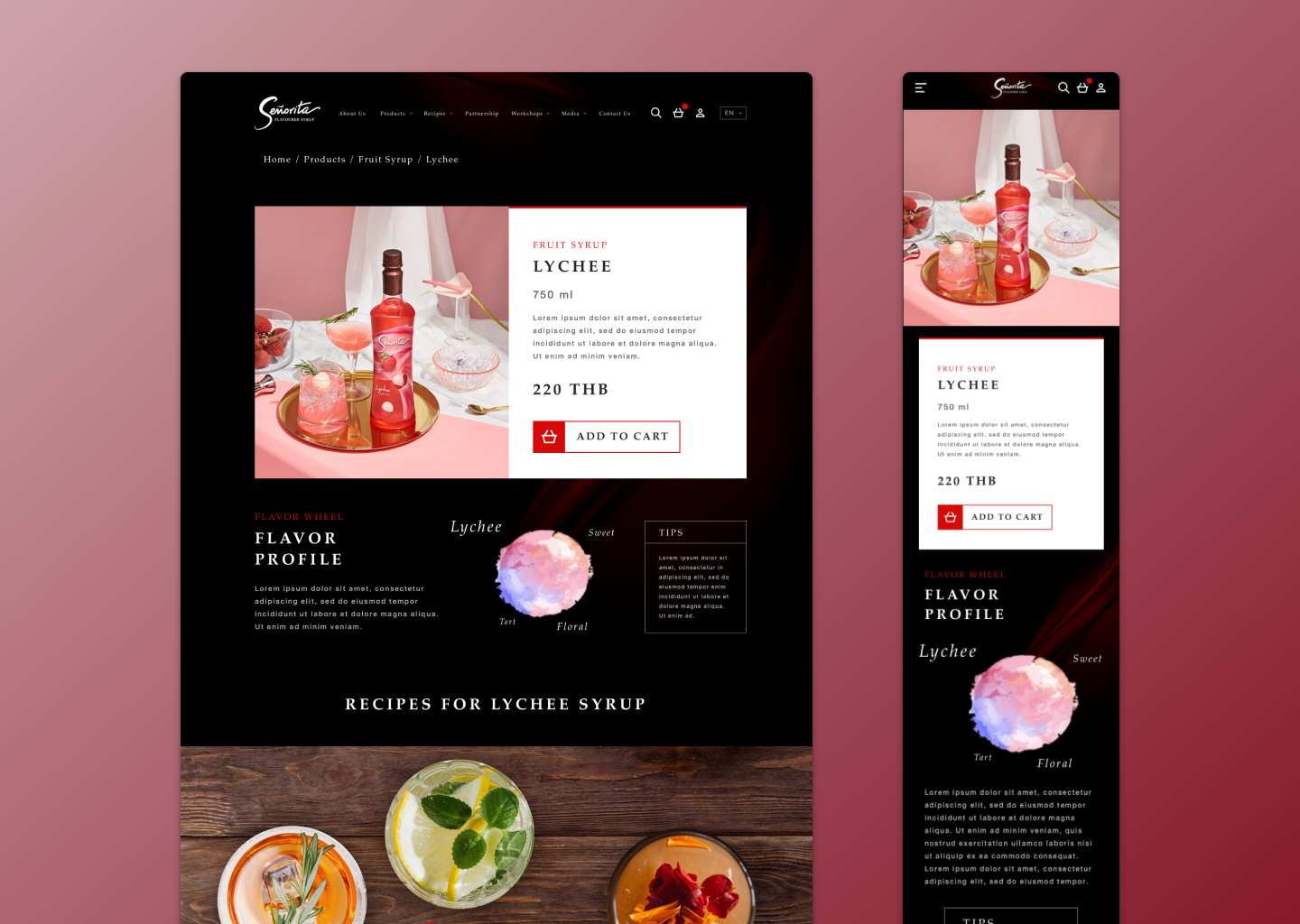
Visual Exploration
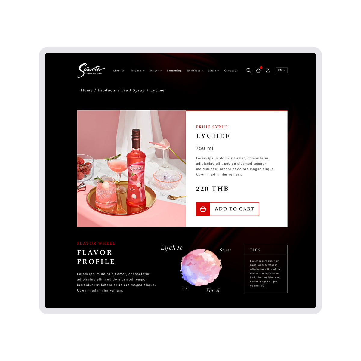
Initially, I experimented with conventional flavor charts—mapping taste notes along axes and profiles similar to coffee bean cupping charts—but found them too rigid and clinical for the sensory experience we wanted. Inspired by how baristas describe coffee aromas, I shifted to a more artistic approach: using soft watercolor smudges to represent the layered flavor profiles of each syrup. User testing revealed that this watercolor palette was not only unique and memorable but also beautifully conveyed the nuanced character of scent and taste. This technique reinforced Señorita’s premium positioning and created an immediate sensory connection for visitors.
Supporting Both Personas
From the beginning, the design approach for Señorita was shaped by the contrasting yet connected priorities of the two key personas: mixologists, who champion quality and creativity, and owners, who balance cost-effectiveness with operational needs. The challenge was to create an experience that addressed both groups seamlessly — delivering sensory storytelling and product quality cues for mixologists, while providing clarity, value, and business-friendly options for owners.
The design achieved this by thoughtfully integrating content, visuals, and features that resonated with each group:
“I care about quality and aroma — I want to know what makes this product unique and how it can help me create something special.”
“As an owner, I’m looking for competitive pricing, clear value, and options that help my business — like bundles or bulk discounts.”


Design Direction Exploration
Instead of settling on a single look, I iterated through two clear visual prototypes before arriving at the final hybrid:
Organic Architecture Direction
Textures & Shapes: Colorful, rounded forms inspired by flowing architectural curves and watercolor smudges
Mood & Tone: Warm, inviting, and tactile—emphasizing approachability and sensory connection
Key Components: Soft-cornered cards, gradient overlays, and fluid hero-image masks
Angular Architecture Direction
Textures & Shapes: Strong, sharp angles drawn from minimal architectural details and grid layouts
Mood & Tone: Precise, structured, and high-contrast—emphasizing professionalism and clarity
Key Components: Crisp typography, red-accented buttons, and rigid card alignments
In each round, I prototyped buttons, recipe cards, and hero sections in both styles and gathered stakeholder feedback. Early reactions praised the warmth of the organic direction and the clarity of the angular approach. In subsequent iterations, I produced hybrid mockups—layering rounded color accents and watercolor textures onto the angular grid and typography. This A/B refinement, guided by rapid stakeholder reviews, resulted in a final UI that marries the vivid expressiveness of curved, colorful elements with the confidence and readability of sharp, structured layouts.
The Result
Project Impact
The Señorita e-commerce experience successfully combined sensory storytelling with a clean shopping flow, helping position the brand as a lifestyle offering rather than just a commodity. The watercolor visual system stood out during user testing, with participants describing it as memorable, premium, and evocative of the syrup’s aroma and flavor complexity. The design effectively addressed both target personas: mixologists appreciated the emphasis on quality and flavor storytelling, while owners valued the clear pricing, cost-saving options, and practical features that supported business operations.

Translating Flavor Into Visual Language
A core design challenge was to express the complex aroma and flavor profiles of Señorita syrups in a way that felt premium and sensory, rather than functional or commodity-like. I developed a visual system that linked each flavor to a unique watercolor-inspired palette. Carefully blended strokes and layered hues represented the depth and richness of the syrups, with each color transition symbolizing a distinct note in the flavor or aroma profile. This approach allowed users to “see” the character of the product before tasting it, creating an emotional connection through visual storytelling.
Deliverables
I delivered a complete responsive e-commerce design system that included:
A flavor-to-visual mapping system using watercolor palettes
High-fidelity UI designs for all key pages and flows
A component library and style guide for development
Visual assets and interaction prototypes to support implementation


The Reflection
What I Learned
Señorita reinforced the value of using sensory storytelling to create emotional connections in digital commerce. The project showed me how visual design can go beyond aesthetics to evoke taste, aroma, and mood — helping to position a product in the customer’s mind as part of a lifestyle rather than just a transaction. I also saw firsthand the importance of aligning design with both creative and business objectives to serve multiple audiences effectively.
What I Would Improve
If I were to revisit the project, I would explore additional user testing earlier in the design process — particularly with owners managing inventory for large-scale operations — to further validate pricing structures, cost-saving features, and the clarity of bulk purchasing options.
What Comes Next
This project strengthened my approach to designing e-commerce experiences that balance emotional engagement with usability and practical business needs. The lessons I took from Señorita continue to influence how I approach storytelling in digital product design, especially in markets where differentiation is key.