
INDA
Case Study · Institute Enrollment Platform
This project focused on redesigning the enrollment website and internal CMS for INDA, Chulalongkorn University’s International Program in Design and Architecture. The goal was to modernize outdated flows, making it easier for applicants to apply and for staff to manage admissions. I led UX/UI design, working with a product manager and full-stack developer to deliver a seamless solution for students and administrators.
Client
INDA, Chulalongkorn University
Year
2025
Role
Main UX/UI Designer
Platform
Responsive Website · CMS · Education

My Role
Main UX/UI Designer
Collaborated with
1 PM · 1 Full-Stack Developer
As the sole UX/UI designer on the project, I was responsible for redesigning the end-to-end experience across both the enrollment website and the internal CMS. I mapped user journeys for students, staff, and administrators, created wireframes and prototypes, and defined the visual system to ensure consistency between platforms. I worked closely with the project manager and the administrative stakeholders (who used and managed the CMS) to ensure the design aligned with project goals, technical constraints, and real-world operations. Beyond design, I also led training sessions to help admins adopt and effectively use the new system after launch.
The Challenge
Problem
The existing INDA enrollment website and CMS were outdated and difficult to use, leading to confusion for applicants and inefficiencies for staff managing admissions. Students struggled with unclear instructions and fragmented steps in the application process. On the admin side, the CMS required manual workarounds and lacked tools to manage applications efficiently, which increased the risk of errors and delays.
Design Goal
The goal was to redesign both the website and CMS to create a streamlined, user-friendly experience. For applicants, this meant clear guidance, progress indicators, and simplified submission flows. For administrators, it meant creating a CMS that made it easier to manage applications, track statuses, and handle admissions tasks without unnecessary manual work.
Constraints
The redesign had to work within the boundaries of INDA’s existing admissions processes and technical systems. One key constraint was that the admin-facing CMS was built on a fixed design system, meaning visual styling and layout components could not be significantly altered — only the flow and interaction logic could be improved. Additionally, the project needed to balance flexibility for administrators with simplicity for applicants, ensuring both user groups could achieve their goals without introducing unnecessary complexity to the system.

The Discovery
Understanding the Journey
I began by mapping the full journey for both key user groups: applicants navigating the enrollment website, and administrators managing applications through the CMS. I worked closely with the project manager and conducted detailed interviews with the admin team — the primary stakeholders — to understand their daily workflows, challenges, and priorities. These conversations revealed pain points such as manual data handling, difficulty tracking applicant progress, and the lack of clear tools for advancing applicants through stages efficiently.
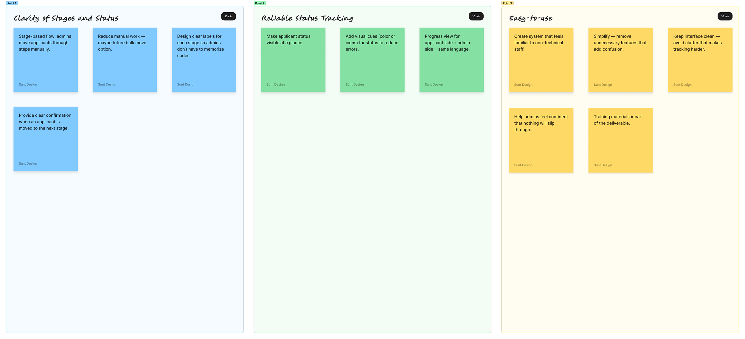
Insights from Stakeholders
The admin interviews provided the clearest direction for the redesign. Their feedback highlighted the need for:
A clear, step-by-step system that allowed admins to move applicants through defined stages of the admissions process
Reliable status indicators so staff could easily see where each applicant stood at any time
Consistent, easy-to-learn interfaces that reduced reliance on workarounds or manual record-keeping
I also lightly referenced best practices from other university enrollment systems to cross-check ideas and ensure alignment with common usability standards.
Stakeholder Voice
During the interviews, administrators shared their firsthand experiences managing the enrollment process. Their feedback provided valuable insight into daily pain points, as well as opportunities for improving both the CMS and the application flow. A few representative quotes captured their priorities and frustrations:
“It’s easy to lose track of where an applicant stands because we don’t have clear stages or statuses — and we have to move each one manually through every step.”

“The forms are too long, with some fields we don’t really need — students often fill things out incorrectly, and we have to follow up manually.”

Key Insights
The discovery phase surfaced critical themes that shaped the design:
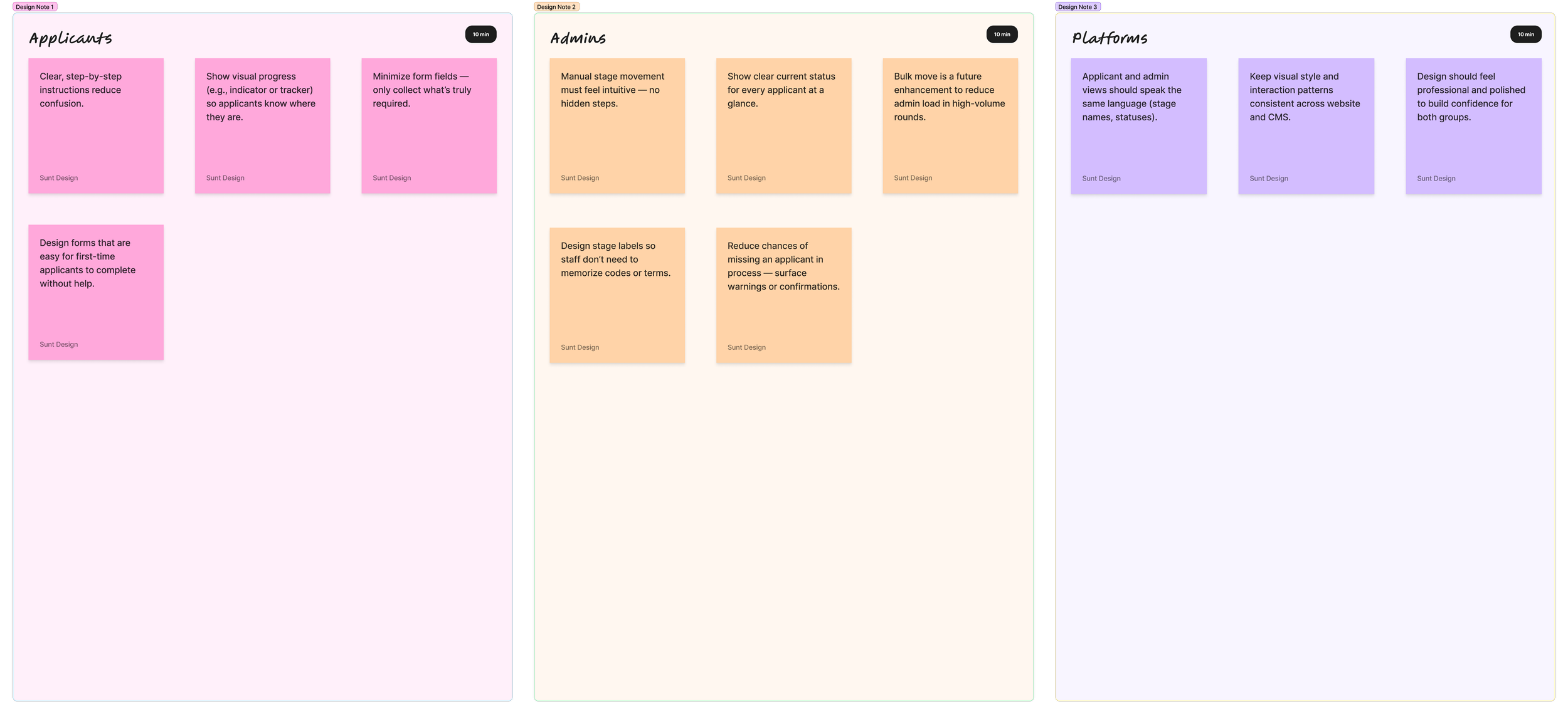
Applicants needed simplicity and confidence. They wanted clearer steps, visual progress indicators, and minimal required fields.
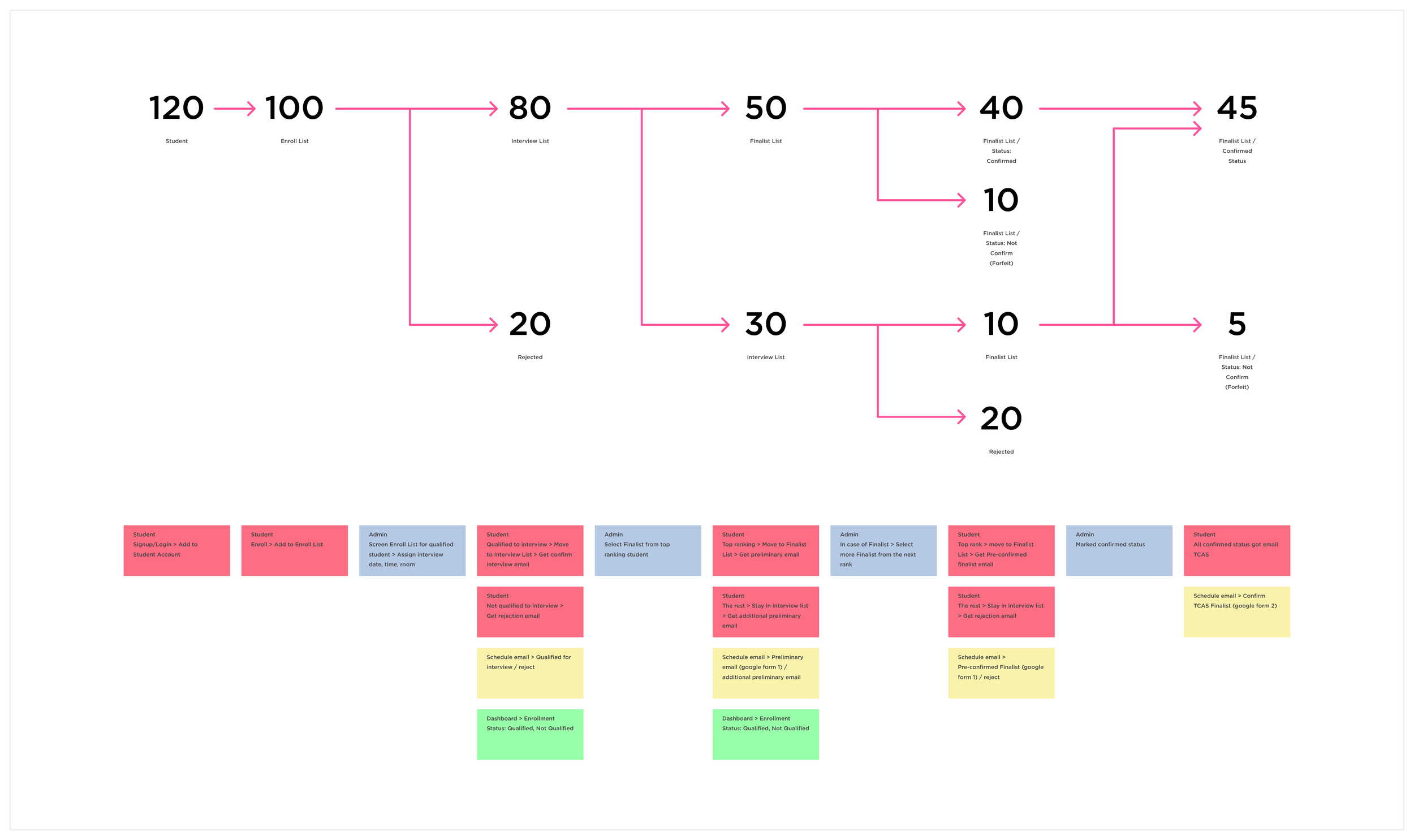
Admins needed structured tools for managing stages. The process had to be intuitive and minimize room for error. Admins typically moved applicants manually through each stage one by one, but highlighted that bulk actions would be a valuable enhancement, especially given the high volume of applicants in each round.
Consistency across platforms built trust. A unified process feels professional and reliable for both groups.
The Design
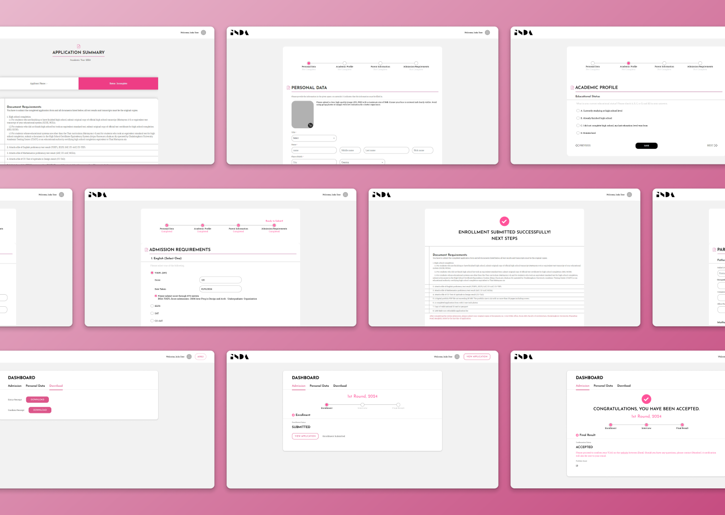
Restructuring the Applicant Workflow
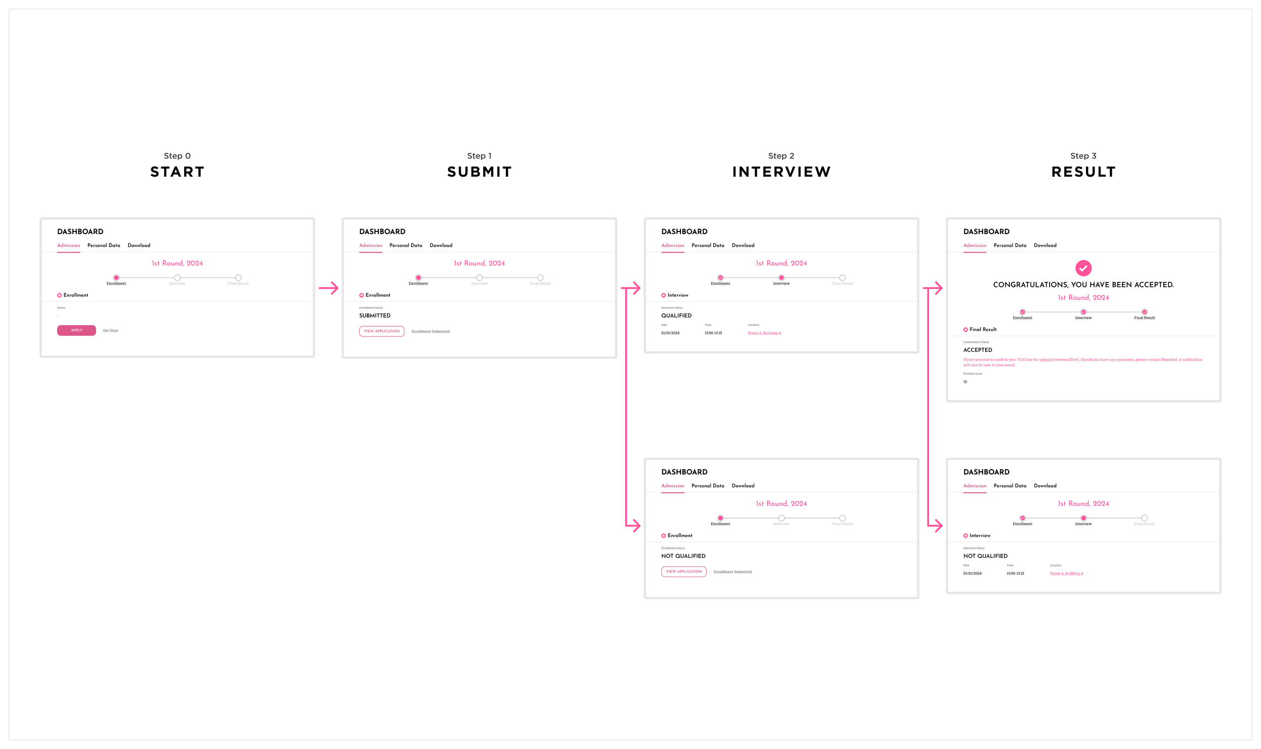
The enrollment website was redesigned to guide applicants through a clearer, step-by-step application journey. I minimized form fields to only what was essential, helping reduce errors and unnecessary effort. The application process was broken into distinct stages with progress indicators and clear instructions at each step, making it easier for applicants to understand requirements and feel confident as they moved through the system.
Restructuring the Admin Workflow
The CMS was restructured to provide a stage-based workflow that allowed staff to manually move applicants through the admissions process with clarity. Status indicators were made more prominent, helping admins track where each applicant stood at a glance. While one-by-one movement remained the default, I proposed a future enhancement for bulk actions to reduce repetitive work during high-volume periods.
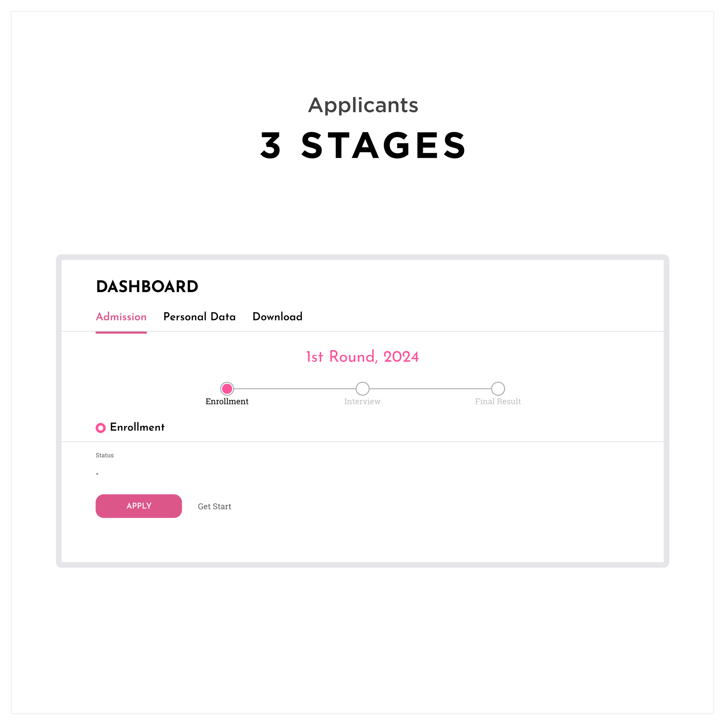
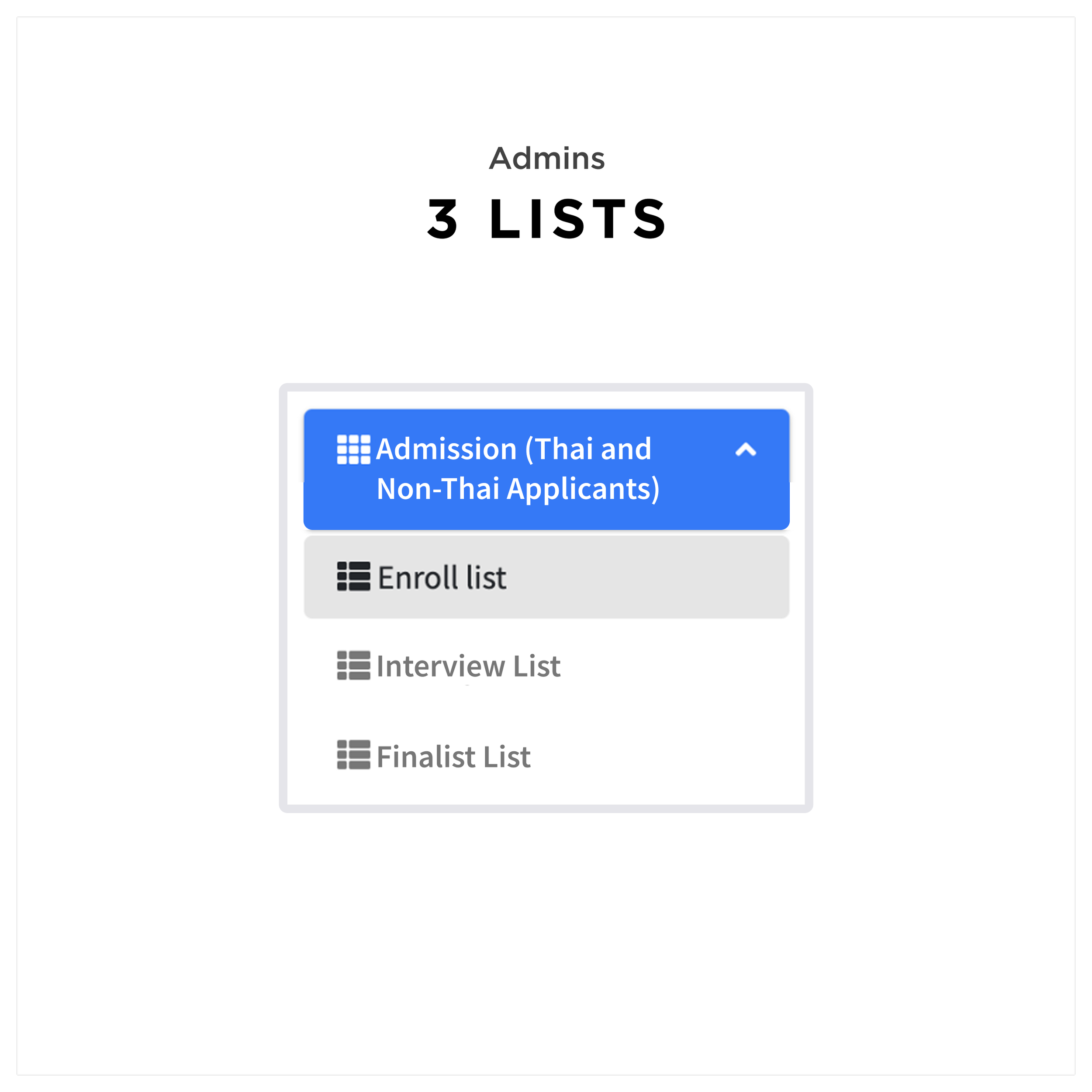
Step-by-Step Experience for Applicants and Admins
The design centered around a clear, structured, step-by-step experience for both applicants and administrators. For applicants, the website guided them through each stage of the application process with progress indicators, clear instructions, and simplified forms at each step. For admins, the CMS provided an intuitive way to move applicants manually through defined stages, with prominent status indicators to reduce confusion and ensure no applicant was overlooked. Both platforms shared a consistent visual and interaction language, using clean layouts and accessible design to build trust and make the system easy to learn and use.

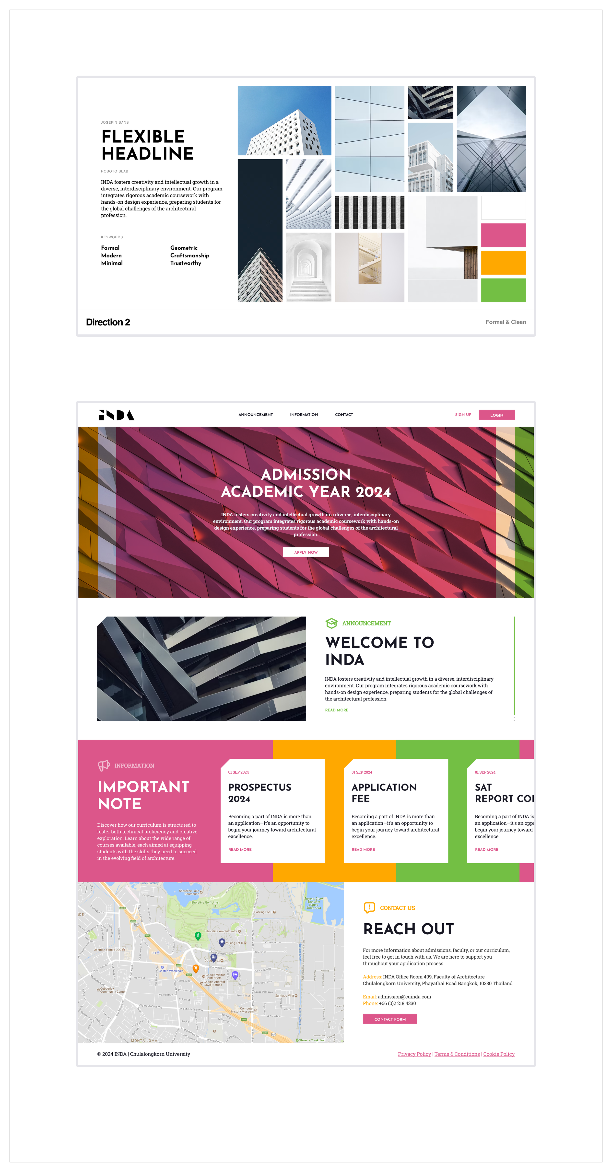
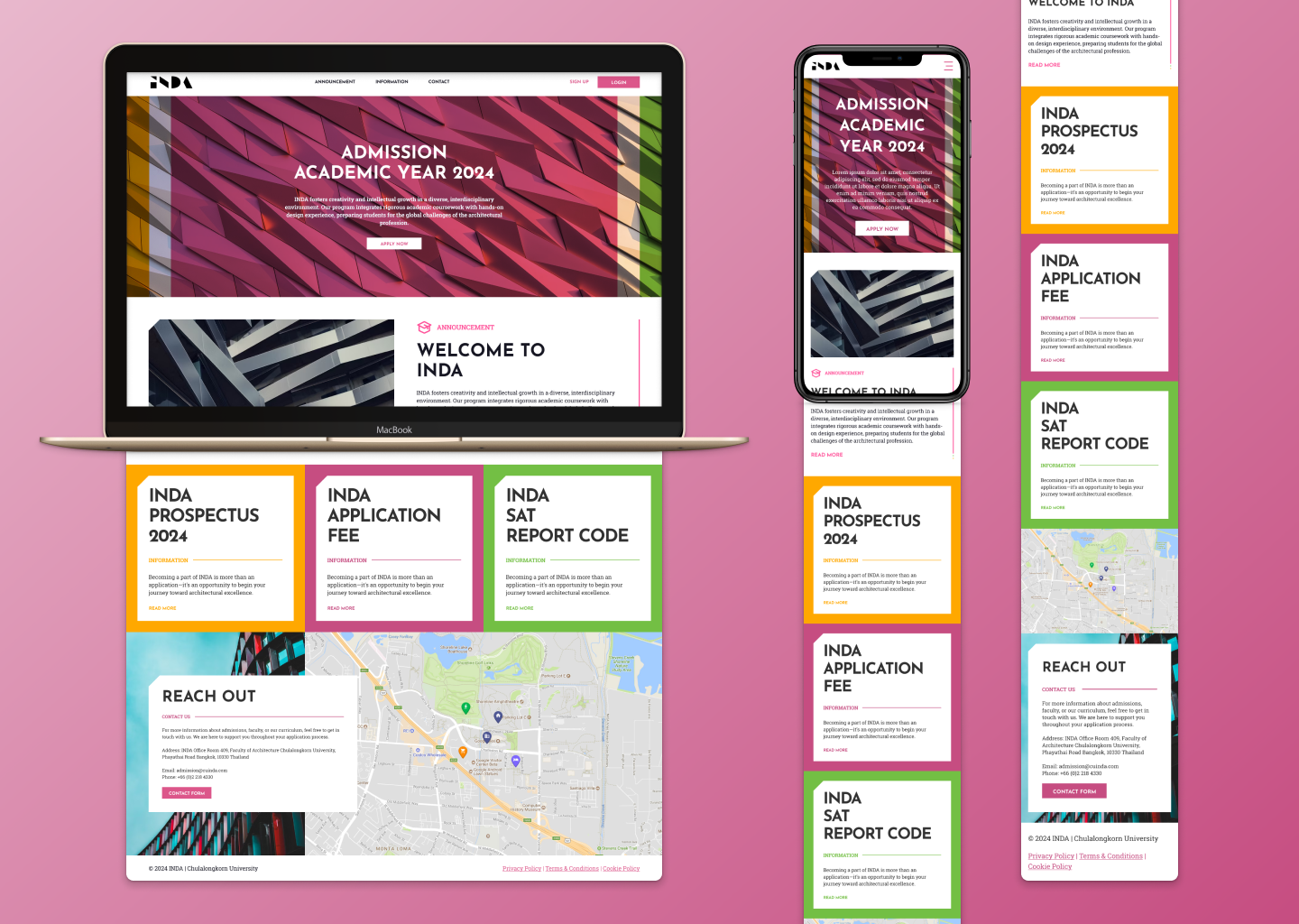
New UI for the Applicant Site
The applicant site was completely redesigned with a modern, clean visual system that balanced clarity with a professional feel. I explored two distinct design directions for the new UI:
Direction 1: A colorful, rounded aesthetic inspired by organic architectural forms, featuring soft curves, warm tones, and textures reminiscent of flowing spaces — creating a welcoming, approachable atmosphere.
Direction 2: A strong, sharp visual language influenced by angular architectural details, using bold lines, clear edges, and an overlay color palette to evoke precision and structure.
Following stakeholder feedback, the final design combined elements of both: it integrated the warmth and approachability of the rounded, colorful direction with the strength and clarity of the sharper, more minimal design. The result was a UI that felt both inviting and professional — aligning with INDA’s design identity while supporting applicants with large typography, accessible color contrasts, simplified layouts, and clear progress indicators.
The Result
For Applicants
The redesigned enrollment website made the application process more intuitive and less overwhelming. Applicants reported greater confidence due to the simplified steps, minimized required fields, and clear visual indicators of progress. The interface helped reduce confusion, especially for first-time and international applicants, and created a more welcoming overall experience.

For Administrators
The CMS provided a more structured and error-resistant workflow. With clearer applicant statuses, intuitive manual stage movement, and improved interface consistency, administrators were able to manage applications with greater ease and accuracy. The system reduced the need for workarounds, minimized manual errors, and cut down on unnecessary follow-up tasks — resulting in a more efficient admissions cycle.
Deliverables
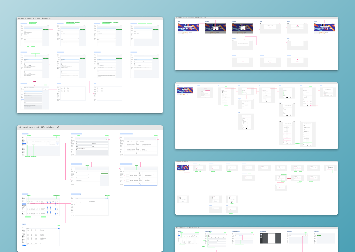
I delivered a complete redesign of the enrollment website and CMS, including:
High-fidelity UI designs and wireflows for both platforms
Interaction prototypes for key flows
Training materials and live sessions to support admin adoption of the new CMS


The Reflection
What I Learned
This project deepened my understanding of designing for process-heavy systems where clarity and structure are critical. I learned how important it is to balance simplicity for applicants with enough control and visibility for admins managing complex workflows. Working closely with stakeholders taught me how valuable direct feedback is in shaping a system that truly supports its users.
What I Would Improve
If I were to revisit this project, I would advocate for earlier usability testing with both applicants and admins to validate assumptions about the flow, particularly how admins manage stages and how applicants interpret instructions at each step. This could have helped refine the structure even further before launch.
What Comes Next
The INDA enrollment project strengthened my approach to designing for institutional platforms where multiple user types interact. The lessons I took from this experience continue to guide how I create systems that balance ease of use, operational needs, and clear communication.